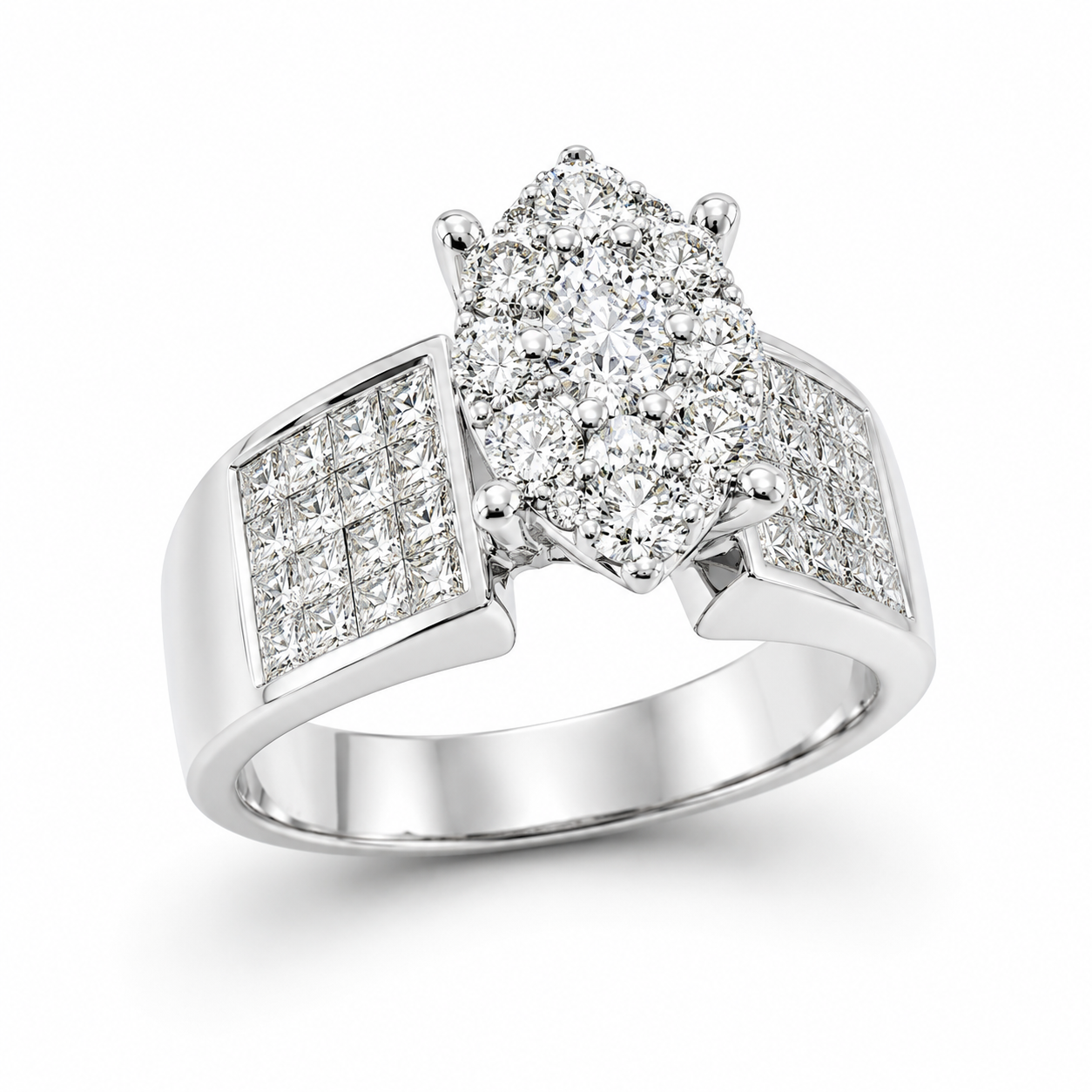
CO14KLSWMQ - 14K White Gold Semi Mount Ring

SKU: CO14KLSWMQ

Sign in to your trade account to view wholesale pricing.

No account?

Crafted to perfection, this 14K White Gold Semi Mount Ring - CO14KLSWMQ is a brilliant foundation for your dream centerpiece. Featuring 14W LS DIA-1.47 carats of sparkling diamonds, it offers a stunning, versatile design that allows you to customize with your chosen gemstone, creating a one-of-a-kind symbol of your love.

● In Stock
SKU: CO14KLSWMQ Tags: , ,

Additional information

Details

14W LS DIA-1.47

Metal

Carat

/* ========================================================= UEJ FOOTER — MOBILE CROPPING FIX KEEP AT VERY BOTTOM OF STYLE.CSS ========================================================= */ @media only screen and (max-width: 767px) { /* ===================================================== FOOTER OUTER WRAPPER ===================================================== */ .site-footer, footer.site-footer, #colophon { position: relative !important; display: block !important; width: 100% !important; max-width: 100% !important; min-width: 0 !important; height: auto !important; min-height: 0 !important; max-height: none !important; margin-left: 0 !important; margin-right: 0 !important; padding-left: 0 !important; padding-right: 0 !important; overflow: visible !important; box-sizing: border-box !important; } /* ===================================================== MAIN FOOTER CONTENT ===================================================== */ .site-footer .footer-inner, #colophon .footer-inner { display: grid !important; grid-template-columns: minmax(0, 1fr) !important; width: 100% !important; max-width: 100% !important; min-width: 0 !important; margin: 0 !important; padding: 34px 16px 30px !important; gap: 28px !important; overflow: visible !important; box-sizing: border-box !important; } /* ===================================================== EACH FOOTER COLUMN ===================================================== */ .site-footer .footer-brand, .site-footer .footer-col, .site-footer .footer-information, .site-footer .footer-links, .site-footer .footer-contact, .site-footer .footer-newsletter, #colophon .footer-brand, #colophon .footer-col { width: 100% !important; max-width: 100% !important; min-width: 0 !important; margin-left: 0 !important; margin-right: 0 !important; box-sizing: border-box !important; overflow: visible !important; } /* ===================================================== LOGO ===================================================== */ .site-footer .footer-logo-link { display: inline-block !important; width: auto !important; max-width: 220px !important; padding: 0 !important; } .site-footer .footer-logo-img, .site-footer .footer-logo, #colophon img { display: block !important; width: auto !important; height: auto !important; max-width: 220px !important; max-height: none !important; object-fit: contain !important; } /* ===================================================== TEXT — PREVENT TEXT FROM GOING OFF SCREEN ===================================================== */ .site-footer p, .site-footer a, .site-footer li, .site-footer span, .site-footer address, #colophon p, #colophon a, #colophon li { max-width: 100% !important; overflow-wrap: anywhere !important; word-break: normal !important; box-sizing: border-box !important; } /* Footer navigation */ .site-footer ul, .site-footer .footer-nav { width: 100% !important; max-width: 100% !important; margin-left: 0 !important; padding-left: 0 !important; box-sizing: border-box !important; } /* ===================================================== SOCIAL ICONS ===================================================== */ .site-footer .footer-socials, .site-footer .footer-social, .site-footer .social-links { display: flex !important; flex-wrap: wrap !important; gap: 9px !important; width: 100% !important; max-width: 100% !important; overflow: visible !important; } /* ===================================================== FOOTER BOTTOM ===================================================== */ .site-footer .footer-bottom, #colophon .footer-bottom { display: block !important; width: 100% !important; max-width: 100% !important; height: auto !important; min-height: 0 !important; margin: 0 !important; padding: 0 !important; overflow: visible !important; box-sizing: border-box !important; } /* * IMPORTANT: * Replaces the existing * padding: 18px 70px 18px 0; */ .site-footer .footer-bottom-inner, #colophon .footer-bottom-inner { display: flex !important; flex-direction: column !important; align-items: flex-start !important; justify-content: flex-start !important; gap: 7px !important; width: 100% !important; max-width: 100% !important; min-width: 0 !important; height: auto !important; min-height: 0 !important; margin: 0 !important; padding: 18px 16px 22px !important; overflow: visible !important; box-sizing: border-box !important; } .site-footer .footer-copyright, .site-footer .footer-certs { width: 100% !important; max-width: 100% !important; margin: 0 !important; text-align: left !important; white-space: normal !important; overflow-wrap: anywhere !important; } } /* ========================================================= VERY SMALL PHONES ========================================================= */ @media only screen and (max-width: 430px) { .site-footer .footer-inner { padding: 30px 14px 26px !important; gap: 24px !important; } .site-footer .footer-bottom-inner { padding: 16px 14px 20px !important; } .site-footer .footer-logo-img, .site-footer .footer-logo { max-width: 190px !important; } }